100% written by a human 
All About Slashes

Leigh Forbes
Overview
There are two types of slashes* in common use today: the virgule ( / ) and the solidus ( ⁄ ).
The virgule is far more frequently used, but the solidus still has its uses (particularly in historical contexts). While at first sight, there might not seem much between them, it’s worth knowing what each was designed for, because if you actually do need the slantiness of a solidus one day, trying to use the virgule in its place will be frustrating.
* Confusingly, the international standard for symbols and characters (Unicode) calls the virgule a solidus and calls the solidus a ‘fraction slash’. But all you need to remember is that the virgule is more vertical, and the solidus more slanty.
So, if you need different types of slashes in your book (typographical rather than horror), it’s working checking how your chosen font displays them before committing to your final design choices. The illustration below shows three contrasting fonts, but if you explore others, you’ll find differences (usually in the angle/sharpness of the ends) between more similar fonts too.
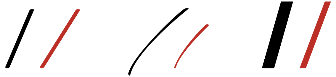
Three different styles of virgule (black) and solidus (red) from Garamond (left), Ruthie (middle), and Impact (right).
Virgule
On your keyboard, you see a forward slash under the question mark – this is a virgule ( / ). The name comes from the latin virgula, meaning ‘twig’ or ‘little rod’. In typography, we use it in a number of ways, the main ones being:
- In general text to indicate an and/or situation. In this case, it’s recommended to leave spaces on either side, but you can make your own mind up according to context and aesthetics:
Example: A ‘glyph’ is a font’s representation of any given letter / character. - In poetry, when the lines can’t be naturally split by line breaks (this time, definitely use with spaces):
Example: My mouth and I are closely acquainted / Having been joined at the lip since before birth / But, despite our attachment, we've never been friends / Due to Mouth's grossly oversized girth. - In computer programming, including internet addresses (definitely no spaces!):
Example: http://www.blot.co.uk - To separate days, months, and years, in abbreviated dates (spaces aren’t necessary, but can make things clearer):
Examples: 11/10/2022 or 11 / 10 / 2022
Solidus
Also on your keyboard, but hidden as an optional character, is the solidus ( ⁄ ). It’s name comes from the latin solidus, which was the name of a Roman coin (more on this in point 2). You can find it by typing opt+shift+1 (Mac), or alt+ctrl+shift+? (PC). In typography, we use it:
- To separate fractions (see also ‘how to build a fraction’, just below), including percent and per mille symbols:
Examples: ¼ ½ ¾ % ‰ - As a marker for shillings in old British money – which was adopted from the roman system: ‘L’ for Librae (pound) became the £ sign, ‘s’ for solidii became shorthand for shillings, and ‘d’ for dinarii became pence. Subsequently, the ‘S’ morphed into ∫ which then became ⁄ :
Example: 3 ⁄ 6 (three shillings and sixpence)
Example: 80 ⁄ – ale (Eighty-shilling ale)
How to build a fraction
Common fractions (e.g. ¼ ½ ¾) are available in most common fonts* as optional characters (check your ‘Emoji & Symbols’ [Mac], or Windows + semicolon [PC, Windows 10+]). But when using less common fonts or fractions, you might have to build your own.
*For reference, Arial, Cambria, Droid, Georgia, Helvetica, Lucida, Palatino, Tahoma, Times New Roman, Trebuchet, and Verdana, all support fractions down to 8ths.
Obviously, you can leave the components of a fraction on the baseline, e.g. 11/16 for eleven sixteenths (see line 1 in the image below), but this isn’t beautiful and can be confusing. So the first thing people often try next, is to superscript and subscript the numbers – raising / lowering their positions compared with the baseline; some software will automatically shrink the font of super/subscripted characters, but if that doesn’t happen, your fraction can look a mess (line 2). Super/subscripting can also lead to problems if the line height is automatically increased to accomodate the raised / lowered numbers, and you can also get problems with the horizontal spacing between characters too. So, what to do?
The line-height can usually be fixed by reducing the font-size of the numbers – which you really need to do anyway (line 3) – and then, if that doesn’t completely solve the vertical spacing, by forcing an ‘exact’ line height (see under your document or paragraph settings). Once that’s done, you still need to fix the horizontal spacing.
This is where the beauty of the solidus comes in. Look on the graphic for the vertical dotted-guide-line… do you see how, with the two virgule-examples (lines 1 & 2), the following ‘1’ is pushed into the next character space? Now look at lines 3 & 4, and see how the solidus has more space for the ‘1’ to tuck underneath, just like a proper fraction. A much more elegant solution!
Line 5 offers extra settings for fettling your fractions even more – a great excuse for procrastination if your software offers a this level of fine tuning and you have time to play.
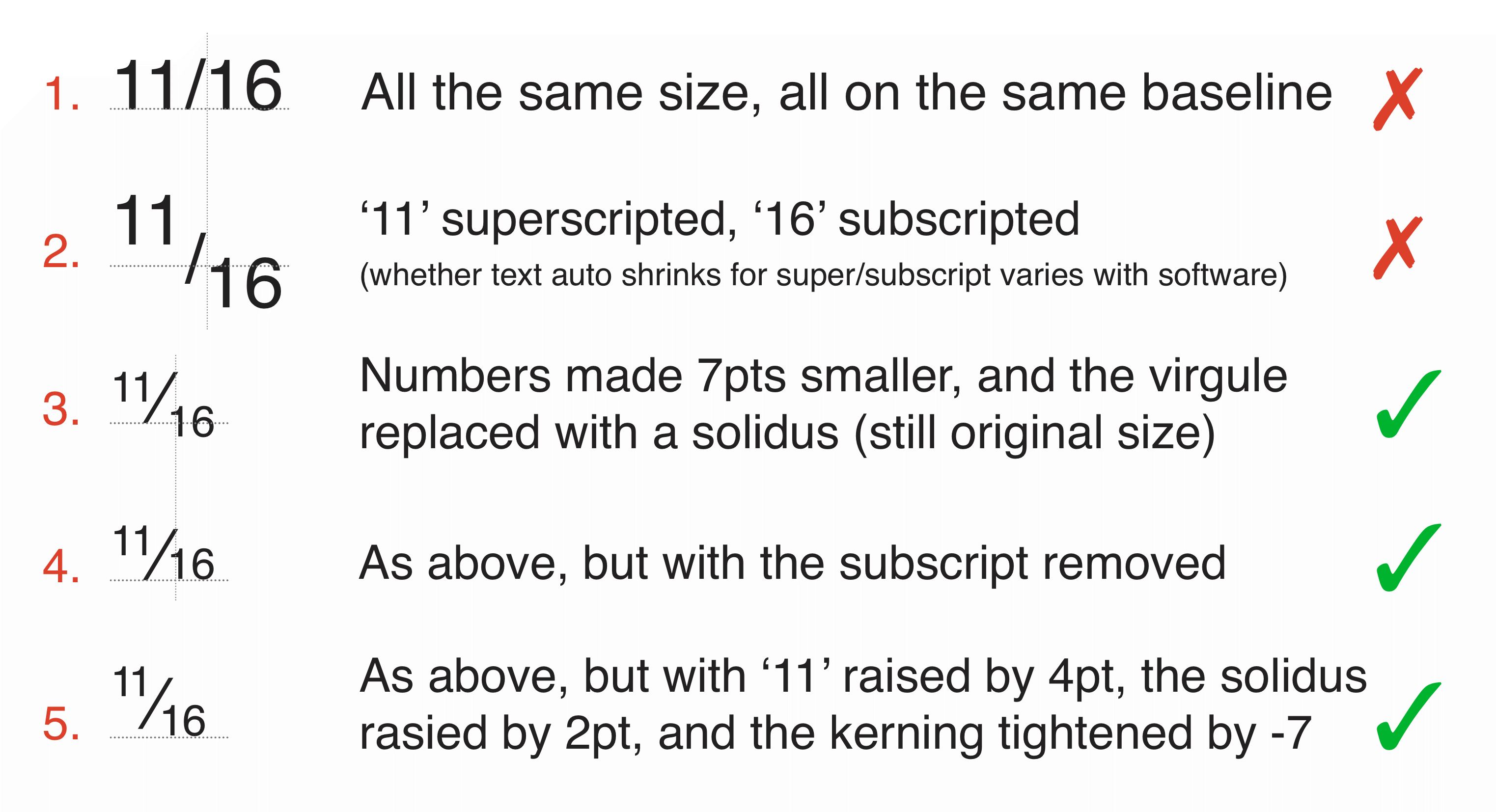
How to build a fraction (see the text for more info).
Summary
| Virgule ( / ) | Solidus ( ⁄ ) | |
|---|---|---|
| Uses include: | Forward slash/divider in general text Poetry end-of-line marker Computing (programming, URLs, etc.) Date divider, e.g. 11/10/22 |
Shilling marker fractions (see also ‘how to build a fraction’) percent (%) and per mille (‰) symbols |
| Where to find it: | Shilling marker fractions (see also ‘how to build a fraction’) percentage (%) and per mille (‰) symbols |
Mac: opt + shift + 1 PC: alt + ctrl + shift + ? |
Related Posts
Choosing Your Font
Readability
All About Dashes
Punctuation & Other Squiggles
Blog Index
Need more help?
If you need help with this topic, or any other formatting issue, come and find me on Bluesky @writeleighso or facebook @blotpublishing