100% written by a human 
Choosing Your Font

Leigh Forbes
What font should I use?
As a designer, I get asked this question a lot, but it’s a vital question to ask, because you don’t want to run the risk of annoying your readers with hard-to-read type, or lumbering yourself with production problems; so it’s good to start thinking about your typeface/font* right at the start of your book-formatting journey, and even better to learn a little about its design and intended uses before making your choice. But five easy words of advice for starters…
Don’t choose Times New Roman 😱 (or any of its spin-offs)
The world’s continued fixation with Times New Roman (TNR) is a pet hate of mine. In my early writing days, it was de rigueur to submit your hardcopy manuscript in TNR, 12pt, double spaced. Obviously, having every MS typographically identical made it easier for slush-pile readers to focus on the content – and admittedly, TNR is an invaluable utility typeface (with all its obscure characters and symbols, it has one of the most extensive glyph-palettes of all✝); but none of those publishers actually published in TNR. Having been specifically designed (in the early 1930s) to be printed at 5½–9pt, in tightly spaced, narrow newspaper-columns (and mashed even more when digitised), it’s a terrible typeface for books. In short, Times New Roman has very many uses, but no beauty, and your book deserves much, much better.
* For the difference between a typeface and a font, see the Nerd Box in our The Naming of Type post.
✝ For a sans-serif equivalent, Lucida Grande also has an excellent range of glyphs, and for non-roman scripts, check out the Noto family of fonts, for which the ultimate aim is to include every glyph in the unicode standard.
Understanding font design and use
There are three main groups of type, which determine their legibility when viewed or printed at different sizes:
- body text (designed for use at smaller point sizes, e.g. as body text in books and magazines)
- display (designed for use at larger sizes, e.g. on posters)
- decorative (designed to be showy, e.g. for eye-catching adverts, etc.)

Examples of body-text typeface (Garamond, left), a display typeface (Futura, middle), and a decorative typeface (FoglihtenNo07, right)
Then, within each of these three main groups, there are four sub-categories:
- serif (with little embellishments on the ends of each letter)
- sans-serif (no embellishments)
- monospaced (every letter is given the same space on the line, regardless of how wide it is)
- script (often designed to look like handwriting)

From left to right, examples of a serif typeface (Iowan Old Style), sans-serif (PT Sans), monospaced (PT Mono), and script (Sign Painter).
To work out which typefaces fall into which categories, you can often get a clue from their names (e.g. Domaine Display, Bodoni Ornaments, Brush Script, Gill Sans), but if you have time and inclination, it’s worth digging just a tiny bit deeper, to explore your typeface’s roots and historical uses, to reassure yourself if will be readable when printed in the size and format you want.
Typeface variants (fonts)
Some typefaces only come with in one style (regular); usually a simple plain (roman) text, which can’t be (truly) formatted in any way, other than by changing its size (also see Faux Styling, below). Most typefaces, though, have familiar variants:
- italic – a type that has been typographically designed as cursive (compare oblique)
- oblique – regular text that has been skewed to slant, not a true, designed italic;
- bold – regular text that has been designed with a heavier, chunkier appearance;
- small caps – when lower-case letters appear as small capitals (not the same as uppercase letters that have been shrunk)

From left to right, examples of Garamond in (left to right) regular, oblique, true/designed italic (note the letter ɑ), and bold.
You might also see further variations, such as light italic, condensed bold, etc., but any variants you want to use in a print book must exist as separate files in your font folder (see image below) otherwise they won’t export to PDF – even if they look fine on your screen (see Faux Styling, below)
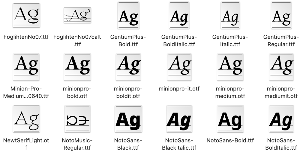
An example of how different font-variants (bold, italic, etc.) exist as individual files in a font folder.
Yes, but how to choose a single font?
Once you understand that typefaces are designed for specific purposes, it’s much easier to narrow down your options: for the main text of your book, I recommend sticking with a 10–14pt serif for your body text. The aim is for this primary font to be as non eye-catching as possible: you want it to be beautiful, for sure, but you don’t actually want readers to notice it – you want them to be focussing on your story, not the typeface. To that end, it’s a good idea to consider fonts already appearing in commercial fiction, and more specifically in your genre. (Check copyright pages of books already on the market – some will offer details of the typeface, size, and line-height used in the body text: for example, a recent foray into my local book shop revealed Bembo, Palatino, Garamond, and Plantin.)
Also check out this post on Readability. This takes a closer look at the structure of body-text fonts, and how it affects their clarity on the printed page.
You can be more liberal with your chapter headers, but don’t go crazy – they still need to be clear. The same goes for your cover, with my only major recommendation being to avoid using italics in your title; it looks naff.
Some typefaces you might like
Garamond, Sabon, Cormorant, Lora, Minion, Baskerville, Caslon are all lovely serif body-text fonts – but there are many others, so go exploring: browse websites like Google Fonts, Fonts.com, FontSpace, 1001Fonts, etc., to find and compare typefaces. There’s usually a window you can type a sample of your text into; but make sure to adjust the size, because your book won’t be printed in whatever the website’s default is (e.g. 64pt – although, if you’re looking for a title-font for the cover, 64pt is fine of course). Paste in a paragraph from your book, set it to 12pt (though it might need to be a bit larger depending on your screen resolution), and go from there.
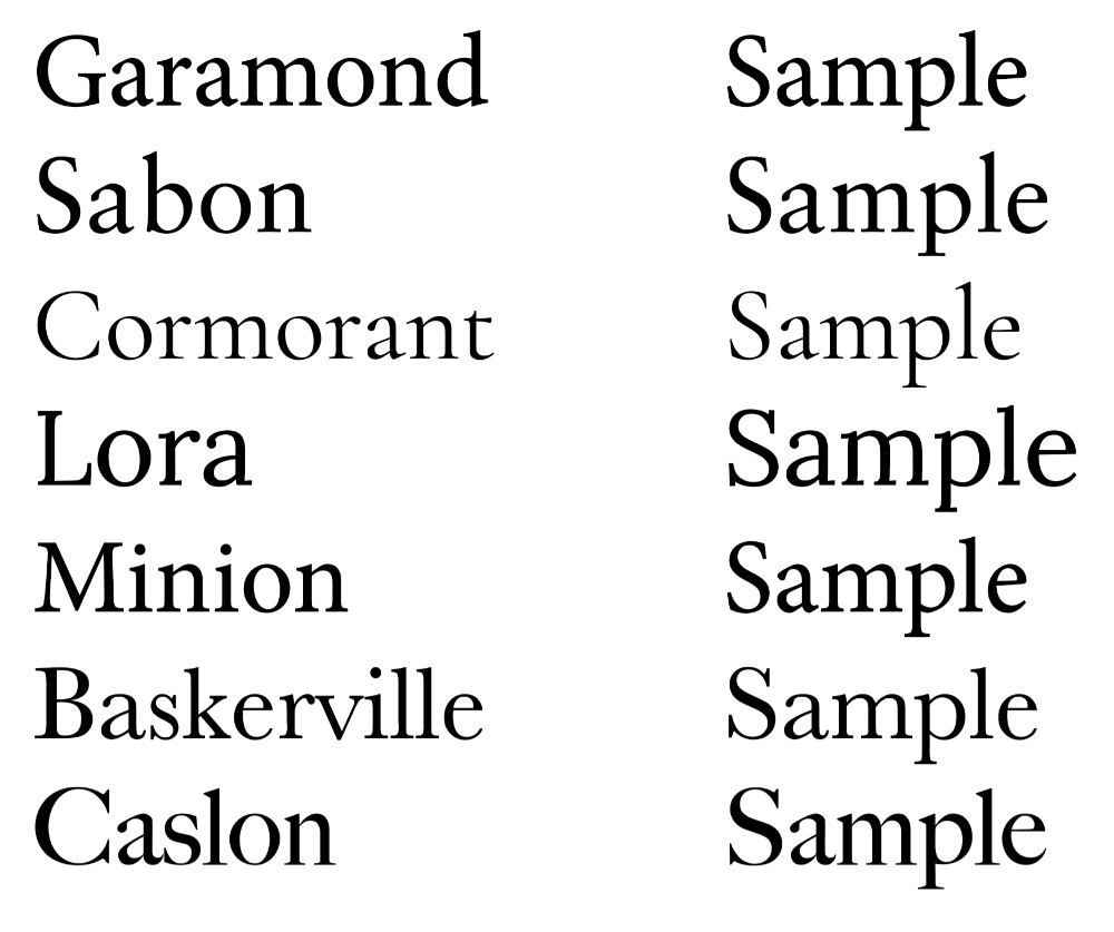
Examples of seven popular typefaces, note how the actual sizes of the glyphs varies, despite them all being 12pt.
Beware free fonts: Many free fonts are great (and are perfectly safe to use), but others can be a right pain: they might not come with matching styles or sizes; they might be badly designed (and look terrible in print), or be pirated or knock-off copies – check the End-User Licence Agreement (EULA) to be sure you can use a font for commercial publishing. (Type designers need to pay their bills too, so please avoid dodgy fonts). And don’t automatically dismiss the idea of paying for a decent, professionally designed font from a reputable type foundry, particularly if you have a whole series of books in mind.)
So be mindful when opting for a free font: make sure it has all the characters/variation you need, that it looks good when printed at the size you want, and that it hasn’t fallen off the back of a lorry. (And don’t forget to check the EULA.)
Understanding “faux styling”
Faux (fake or false) styling is a trick used by your computer when the typeface you have chosen doesn’t have a particular variant. Let’s take bold: your computer can always apply a bold-like appearance to your text, to make it look bold on screen, but this not real. When you print, or convert to pdf, the bold will be gone.
You can avoid this by making sure your chosen typeface has all the variants you need; you can find them by opening your computer’s font folder, and checking the individual files: look for names like Menlo-regular.ttf, Menlo-bold.ttf, Menlo-italic.ttf, Menlo-bolditalic.tff – with these you can use regular, bold, italic, and bold-italic for the typeface “Menlo”, confident that they will export to PDF and print correctly. (See the file-type image above.)
A final word…
If you have employed a designer, and they leave their name off your book, it’s might be because you’ve insisted on a particularly jarring design-feature (often a weird/inappropriate typeface), and they don’t want folk to think that’s how they design books by choice. I urge you to listen to your professional helpers and seriously consider their advice.
Related Posts
Stylesheets
Hyphenation & Justification
Tracking
Kerning
All About Slashes
All About Dashes
Punctuation & Other Squiggles
Whitespace
Readability
Blog Index
Need more help?
If you need help with this topic, or any other formatting issue, come and find me on Bluesky @writeleighso or facebook @blotpublishing