100% written by a human 
Kerning

Leigh Forbes
Overview
Kerning is one of the two main controls you have over the horizontal space in your text (the other one is tracking, which alters all the spaces in any given chunktechnical term of text). Kerning, on the other hand, alters only the space between a particular pair of glyphs (letters, numbers, symbols, spaces, etc.). These controls are easily abused, so be mindful how you use them.
Once you look into the relationship between two or more characters in a word, you realise what a mess it can be – not unlike other relationships.
—Erik Spiekermann
BE AWARE: word-processing software often offers only clunky preset-values for tracking (might be called ‘character spacing’), with no fine-tuning, usually resulting in text that looks worse, not better. How would you like your text to be spaced? Normal, crushed, obliterated, baggy, or making a break for freedom? Use with caution.
Kerning
Not all letters are created equal: in a proportional font (the kind you want for book design), letters are automatically allocated their own horizontal space according to their width; BUT, letters sit with each other in different ways, depending on whether they’re straight or curved or upright or slanted, often creating an illusion of either too much space between them, or too little. The combination of such tricky letter-pairs can leave text looking unbalanced: gappy over here, crushed over there. Kerning is the process of fixing those unbalanced spaces, and it was a skills early scribes learned – how to draw letters so the spaces between them looked the same, regardless of how wide those spaces actually were. It’s a skill that is still taught in modern-day calligraphy, and it’s hard.
If letters in a text are spaced too uniformly, they make a pattern that doesn't look uniform enough.
—Ellen Lupton
In the days of printing with moveable type, and letters were set individually – each on their blockSORT:
the block into which each letter is cut – it wasn’t possible to adjust the space each one occupied (as it was a wood or metal block of fixed size). If you wanted certain letters closer together, you had to cut new blocks specifically for that purpose, with strokes hanging off the edge to allow its block to sit inline with others, without the glyph itself being constrained.
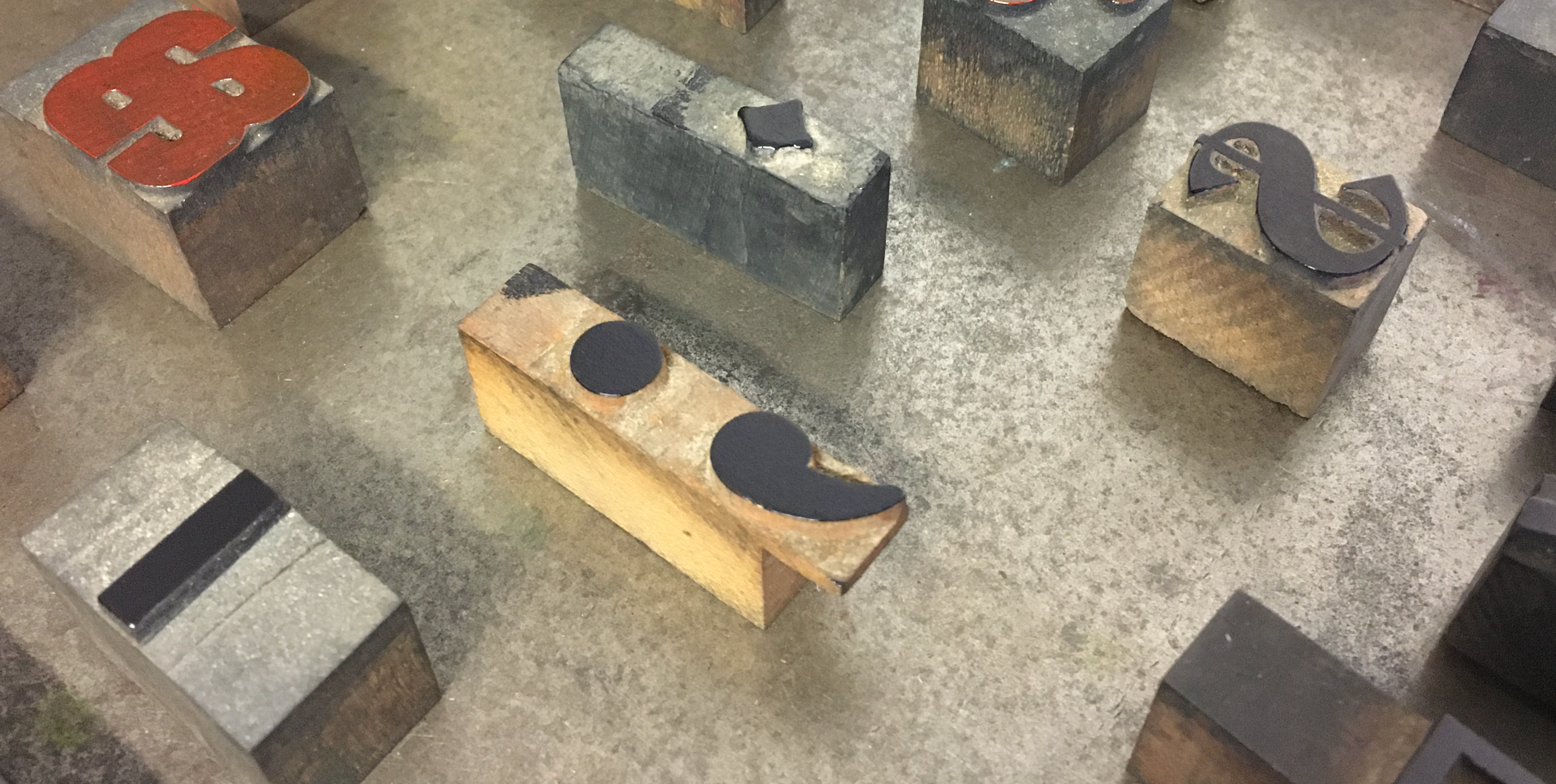
A semi-colon, cut to allow it to sit partially below the baseline.
Mercifully, good quality, modern fonts have inbuilt ‘kerning tables’ – a list of all the problem letter-pairs (hand-tweaked by the type designer) telling your software how to fix (most of) those quirky spaces without you ever knowing they were there.
BE AWARE: many free fonts are great, and fine to use in your book, but others will come with only a basic kerning table, or without one at all, which risks leaving your text looking seriously rough. Be mindful when researching fonts to use. (See also Choosing Your Font.)
Kerning Problems
As well as potential problems with free fonts, it’s still possible to find kerning issues even in reputable paid fonts; but these are most obvious (and so most likely to need fixing) when text is large and/or in all caps – on your cover, in titles, and chapter headings, and this is where it’s worth fixing them by hand (assuming you have fine-enough control over the settings). If you keep finding problems in your body text – change the font.
What to look for
The most prevalent letters in kerning tables are usually those with slanted or curved stokes, or a lot of open space within their allotted rectangles (e.g. W, P, T). The glyphs can struggle to look balanced, particularly when paired with similarly contrary glyphs. Look for jarring gaps between letters, or places where serifs are touching or quotation marks overlapping. If you have no kerning controls at all, you can highlight the dodgy pair, and use tracking to adjust them instead. (Or find another font.)
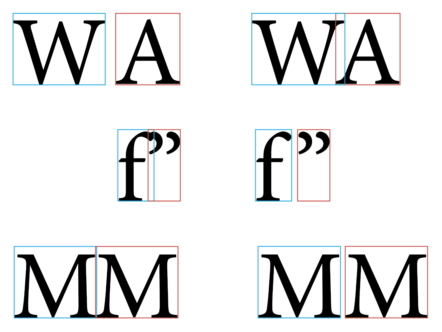
Examples of poor or no kerning (left), and automatic or manual kerning (right)
Glyph Scaling 😱
Don’t ever be tempted to change the width of the letters themselves (glyph scaling) – there are two-hundred thousand typefaces out there, so if the one you’re using has letters too wide or too narrow for what you need, find another typeface (see also Readability). And if you find you’re constantly coming up against problem-lines that can’t be fixed by simpler means, consider changing the size of your font or the measureMEASURE:
the width of your column of text; the line length (i.e. changing the page margins). And if neither of those work? Feel free to ask for advice.
Related Posts
Tracking
Hyphenation & Justification
Choosing Your Font
Readability
Whitespace
Blog Index
Need more help?
If you need help with this topic, or any other formatting issue, come and find me on Bluesky @writeleighso or facebook @blotpublishing