100% written by a human 
Hyphenation & Justification

Leigh Forbes
Introduction
This post is about how to control your software’s use of hyphenation and justification (H&Js) to manage the spaces between words on a line, particularly where long words are involved. Having at least a little knowledge about how this works is vital for producing a well-formatted and beautiful book for print.
This topic is most relevant to print books with fully justifiedFULLY JUSTIFIED: when the text lines up to both the left- and right-hand margins text – when your software kicks in with automatic hyphenation to keep the words well-spaced, easy to read, beautiful to look at, and not annoying. Effective hyphenation can also save space that you’d otherwise waste on over-stretched lines. (See also posts on Tracking and Kerning.)
Hopefully, the software* you’re using to format your book for print, will offer you at least some control over H&J settings. Be aware that any values you enter might well affect your whole book in one go – and, conversely, your margins, typeface, font-size, and even your writing style will all affect how the hyphenation is implemented; so take a look at how these factors interact with each other before you start on your layout. If you can, I suggest taking a bit of time to experiment with your first chapter: try out sample settings and watch how the size of the word-spaces varies with different values. (Remember, hyphenation only works with fully justifiedFULLY JUSTIFIED: when the text lines up to both the left- and right-hand margins text.)
The [H&J] process can be viewed as an internal dialogue within your computer program that goes on constantly as you type. The dialogue gets quite heated as end-of-line decisions have to be made.
—James Felici
* When you are formatting your layout (for final export to pdf), I strongly encourage you to use software that offers at least some text-manipulation features (like hyphenation). The more geared towards pure writing your software is (Scrivener, Pages, Word), the the fewer options you’re likely to get, and maybe none at all. Conversely, the more geared towards layout your software is (Affinity Publisher, Quark, InDesign), the more options you’ll get (though I appreciate these latter apps are expensive and can be complicated to use).
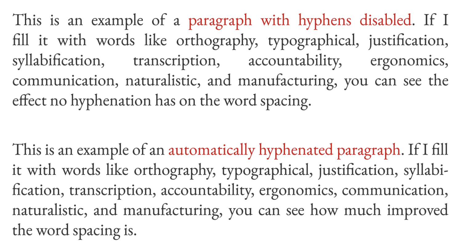
What good hyphenation looks like
Good hyphenation occurs at that (fine) balance between badly spaced text, and too many hyphens: the aim is to keep the gaps between your words as consistent (and as readable) as possible, while avoiding broken words at the end of every line. A simple guide is: the wider your measureMEASURE:
the width of your text column, which in a single-columned book, is the space between your margins. Your line length., and/or the shorter your words, the fewer hyphens you are likely to need. To a greater or lesser extent, the amount of hyphenation you end up with will also depend on your genre/topic (short or long lines), your writing style (short or long words), and the language you’re formatting.
Hyphenation Dictionaries
Your software will apply hyphens based on algorithmic hyphenation (faster) or dictionary-based hyphenation (more accurate), or a mixture of both. Either way, any auto-hyphenation requires the computer to follow the correct rules, and consult the correct dictionary in order to avoid issues thrown up by different languages hyphenating in different ways and for different reasons, e.g. whether words are broken between syllables as they are written (e.g. English) or spoken (e.g. French).
The length of the average word will come into play too; if you are formatting German, your software will definitely need to know, so it can cope with words like OrthographievereinheitlichungTRANSLATION:
orthography standardisation (which, even at 29 letters, is nowhere near the longest word in the German dictionary). So, even if your software reckons to detect languages without being told, make sure you have the correct language applied to your project.
Hyphenation settings
How close you can get to optimal hyphenation depends on how much control your software gives you over the settings. You might only get a choice between automatic and manual hyphenation (opt for auto, then switch to manual for tricky paragraphs), but if you have more choice, below are some of the options you might get, along with my suggestions for values to use (intended for English only).
| Option | What it means | Suggested value |
|---|---|---|
| minimum word length | what’s the shortest word you’re prepared to break (the default might be as low as 5) | 6 or 7 |
| letters before | the minimum number of letters you want before a hyphen (the default is often 2) | 3 |
| letters after | the minimum number of letters you want after a hyphen (again, the default might be as low at 2) | 3 |
| Hyphens in a row | how many lines in a row are you prepared to have end in a hyphen | 2 (3 if you can bear it) |
| Hyphenation zone | Only applicable for left-justified text (the larger the number, the wider the right-hand ragRAG: how straggly the text looks on the right-hand side) | n/a for full justification |
| Break capitalised words | Do you want capitalised words (e.g. names, acronyms) splitting across a line break? | No. (But use your judgement if you hit a problem) |
| Hyphenate last word | Do you want the second half of a hyphenated word alone on a new line? | No! |
| Hyphenate across column | Do you want a page to end with a broken word? | NO! |
| Hyphenate by line or range | You can ask the software to consider hyphens on a line-by-line basis (clunky), or by paragraph / number of lines. (This feature might be under justification settings.) | Range |
| Hyphenation range | The number of lines (at a time) over which you want your hyphenation (and so word spacing) evened out. | normal books: 8–10 lines narrow columns: 20–30 lines |
| Manual hyphenation | This is when your software offers you different options for hyphenating specific words. It does not mean typing in hard hyphens! (see Types of Hyphen, below) | Decide on a word-by-word basis, depending on the options you’re offered |
Justification Settings
If you have access to justification controls (not all software offers this), you can also play around with these to find the best values – results will depend on the font you’re using, so be mindful if you’re copying settings from one project to another. These are my suggestions for a starting point.
| Minimum | Desired | Maximum | |
|---|---|---|---|
| Word spacing | 70% | 100% | 130% |
| Letter spacing | -5% | 0% | 5% |
| Glyph scaling | Here be dragons 🐉 | 100% | More dragons 🐉 🐉 |
Types of hyphen
| Uses | BE AWARE | Where to find it | |
|---|---|---|---|
| Hard | This is the hyphen you type yourself for hyphenated words or phrases | Hard hyphens will stay put, regardless of how your text is restructured later, so do not use them to force line breaks – use soft hyphens instead (see below) | On your keyboard |
| Non-breaking | Use a non-breaking hyphen when you don’t want a line to break around it, e.g. if you have a web address with a hyphen, and you don’t want any ambiguity about whether it should be there or not | Non-breaking hyphens also stay put regardless of what happens around them, which might cause justification problems (over-stretching or tightening your text too much). Use with caution | Varies – check your software’s help menu. (Visit Hyphenation 24 for help with placement) |
| Soft (discretionary) | This is a hyphen you can type yourself to force a line-break, but the software will remove it if the text flow changes and it’s no longer needed | There are no risks to using soft hyphens, but if you find you’re using a lot of them, you might want to adjust your H&J settings instead | Varies – check the help menu. (Visit Hyphenation 24 for help with placement) |
| Automatic | Placed automatically by your software to break long words over a line-end, according to the limits you set for their use (see your software’s H&J settings) | It’s vital to define H&J limits before starting on a new project, as changing them later can mess up everything 😳 | Controlled by software’s H&J settings |
| Nobreak | This is a setting you can apply to letters or words you do not want broken, e.g. those that are already hyphenated for other reasons (see also hyphenation problems, below) | Can lead to justification problems if you use it on a long word that then won’t break over a line end. Use with care | Not all software has this feature, so check the help menu |
| Word Joiner | Think of this as a tie that holds two glyphsGLYPH: a single letter, punctuation mark, typed symbol, etc. together, to stop them splitting over a line-end. Useful for holding em-dashes/elipses together with a following closing quote mark | No real risks, unless you use loads of them in the same line (e.g. trying to hold a URL together) – then they can cause overly tight text, so look for another solution first. | Not all software has this feature, so check the help menu |
Hyphenation problems
Even with careful experimentation and sensible settings, you might still get problems. Here are some common issues, and suggestions for how to fix them:
| Problems | Potential solutions |
|---|---|
| Double hyphenated words: when an already-hyphenated word breaks at the end of a line, adding another hyphen, often quite close to the first one. These look bad and can be confusing. | Try using your software’s tracking settings to tighten or loosen the text to stop the word breaking (or so it breaks on its own hyphen) – final draft only! |
| Separated punctuation: when an ellipsis ( … ), em-dash ( — ), or other punctuation mark is separated from its parent word or following closing quote, and wrapped to be the first glyph in a new line. Jarring. | Fix with a word joiner or nobreak option (see Types of hyphen, above). |
| Web addresses: many URLs already contain hyphens, so the appearance of a new line-break-hyphen is ambiguous – is it part of the address or not? This also applies to other technical strings of text like serial numbers or academic references. | First, check the URL can’t be shortened (e.g. if there’s a question mark, try deleting that and everything after it, and see if what remains still works). And/or find a natural break (a slash is best), and force a line-breakKEYBOARD SHORTCUT shift + return there. If the URL is on a line of its own, centre it. |
| Weird hyphenation: words breaking in bizarre places or not at all (when they should) | Check your software is has access to a dictionary for hyphenation, and that it matches the language you’re working in, e.g. Duden for German. Don’t wing it; different languages have different hyphenation rules. Delete any hard-hyphens you previously typed in to force line-breaks, and replace them with soft hyphens instead. |
Related Posts
Tracking (layout)
Kerning (layout)
Whitespace (layout)
All About Dashes (punctuation)
Blog Index
Need more help?
If you need help with this topic, or any other formatting issue, come and find me on Bluesky @writeleighso or facebook @blotpublishing