100% written by a human 
Stylesheets
Leigh Forbes
Overview
The time to start using stylesheets is now; it’s never too late¹.
Even if you haven’t yet made your final choices for typeface and font-size, and have no idea about margins or line-heights or first-line indents, start applying styles to your text as soon as you begin to write. Any styles – it doesn’t matter what they are or what you call them, just use them. You can change the details later. (Do I do this for all my own writing? Of course not. Have I cursed myself multiple times for not starting with stylesheets? Every. Single. Time.)
Even with writing software that offers little in the way of layout features, you usually have some control over styles – for example, some software only offers you the ability to format a paragraph of text in the style you want, then use that as a template to ‘copy/paste style’ onto other paragraphs. Either way, check what options you have available, and take time to work out how to use it. You will thank yourself later.
Where to start
Most writing software will offer you at least two ways of viewing your page on screen: layout/page mode or composition mode. Layout is where the page is shown on the screen with margins and page edges, like a real sheet of paper, and this is the one to use when choosing your formatting specifics and defining your styles. (By contrast, composition mode fills your screen with text and you have little or no idea of margins or page thresholds – except perhaps a faint dotted line.)
Page size
Once you’re ready to think about what your text is actually going to look like, start with fixing your page size. In layout/page mode, what you will probably see is your software’s default page size (A4 in the UK, or ‘Letter’ in the US), and unless you’re doing a report for work or publishing your book in A4/Letter format, your final page-size is likely to be much smaller – and your typeface, font size, line heights, etc. will need to match. So create a custom page-size FIRST, to match your book’s final trim-size, and style your text to fit with that. (In the UK the default size for paperback novels is B-Format, which is 198 x 129 mm.)
Default styles
Firstly, unless you have plans for them, get rid of all those default styles you’re never going to use: ‘balloon text’, ‘comment reference’, ‘document map’, etc. If you can’t actually delete these, you should at least be able to hide them.
Depending on your software, your writing might be automatically allocated a default style called ‘body'’ or ‘normal’, or – if you’re unlucky – ‘no style’. (In which case, apply a style immediately, as you can’t go back and edit something that doesn’t exist.) If you then make a formatting change to your text (e.g. italicise a word), you should see its style change to body+ or normal+, and if you later edit that style, your italicised word should stay italicised. See also the Be Aware box below.
Language
You might find your software allocates a language to each of your styles, so make sure this is right for you, as it can affect any spelling and grammar checks you make, as well as automatic hyphenation.
Custom styles
For a simple novel, you really only need four styles: chapter headings, body text (first-line indent), body text (no indent), and page numbers (it’s rarely worth creating styles for prelims). Additional styles might be needed for chapter sub-headings, mixed-text within your narrative (letters, diary entries, etc.), section-break markers like asterisks, and so on. And if you’re writing non-fiction, it’s a good idea to create styles for any photo captions, tables, block quotes, running heads, endnotes, bibliography, index, etc.
Character styles
These control features like typeface, font-size, kerning/tracking (tighten/loosen), all caps, small caps, italic, bold, sub/superscript, etc. Anything that specifically relates to the glyphs themselves.
Paragraph styles
These control features like indents (including first-line indent), line height (also called ‘leading’), space before/after, and text alignment/justification. I strong advise against using ‘widow/orphan control’ or ‘keep lines together’ as these really don’t work for book layouts.
Connected styles
Some software automatically links (or gives you the option to link) a character style to any given paragraph style, so you can change both aspects of the text at once; but see also the Be Aware box, below.
BE AWARE
Depending on your software, it’s possible to overwrite your formatting by mistake. Some software offers the option to ‘keep overrides’, or to apply only a paragraph or character style; but others will automatically apply a paragraph style with its paired character style, meaning you’ve lost the italics you added earlier, when you were only wanting to remove the first-line indent. Only you know how you work, so try experimenting before you get too stuck into your book design, and be mindful of any formatting you apply independent of your stylesheets (and the fact you might lose it later). Always create new styles when practical.
Don’t forget the pilcrow
Any style (character or paragraph) applied to a particular block of text, will also be applied to its following pilcrow, and will be carried forward when you hit return. So make sure to include/exclude the pilcrow ( ¶ ) in any style change, depending on what you want to happen next. (If you can’t see the pilcrows, look in your help menu for ‘show invisibles’ or ‘show hidden characters’.)
Some style examples for a simple novel
Here are some basic settings to get you started with stylesheets in your novel. Typeface, size, weight, caps, tracking, and kerning should be under character styles. Indents, alignment, and spaces before/after should be under paragraph styles.
| Chapter number | Chapter title | Chapter sub-title | Body text | 1st line (no indent) | Inset text | Running heads | Page numbers | |
|---|---|---|---|---|---|---|---|---|
| Typeface | body text or display | body text or display | body text | body text | body text | body text | body text | body text |
| Size (pt) | 16-20 | 16-20 | 10-14 | 10-13 | 10-13 | 10-13 | 9-11 | 9-11 |
| Weight | bold | bold | bold or normal | normal | normal | normal | normal | normal |
| All/small caps | n/a | if you like | probably not | no | no | no | if you like | n/a |
| Tracking | Probably not | 5-10% if using caps | none | none | none | none | 5-10% if using caps | none |
| Kerning | check individual pairs | check | probably not | none | none | none | none | none |
| 1st-line indent | none | none | none | 1-2x line height | none | none or 1-2x line height | none | none |
| Alignment | left or centred | left or centred | left or centred | fully justified | fully justified | fully justified or left | centred or outside | centred or outside |
| Space before | 5-6x line height | none or 1x line-height | none or 1x line height | none | none | 1x line height | none | none |
| Sapce after | none | none | 1-2x line-height | none | none | 1x line height | none | none |
Habits to avoid when writing
Until you have your page-size and stylesheets finalised, don’t waste time trying to format your text as you write. Any forced returns, tabbed line-breaks, hard hyphens, etc., will move, and you’ll be forever finding weird formatting in random places (I see a lot of this). Using stylesheets and good formatting will save you loads of time later. Below is a list of habits to avoid, and what you can do to avoid the headaches:
(Confession: as I fill in this table [in Scrivener] I can’t help adjusting its width to keep the text looking balanced, even though I know the changes I make now will have zero effect on the final (online, html-coded) version of this post. Such a waste of time, but even I do it.)
| habit | why not? | use instead |
|---|---|---|
| Space space space space space space | If you decide to change the spacing later, you have to do this manually with each instance | First-line indent, or – for tables only – tabs |
| Tab (for first-line indents) | Default tab settings are much too wide for first-line indents, and it’s harder to make global changes. | First-line indent. if you must use tabs (please don’t), set the first-line-indent tab at 1-2x your font-size (e.g. 12–24pt for a 12pt font). |
| Return return return return return (to force a new page) | Unless you write a perfect first draft, your pagination will change, and you’ll have large chunks of nothingness in random places. (As much as I love whitespace, this is not a good look) | Page break |
| Space before/after for normal paragraphs | You don’t need these in fiction, nor in most kinds of non-fiction. Plus they take up loads of space. | Have each paragraph follow on directly from the previous one (except with block quotes, and other inserts). If you find you need more space between lines as you write, set your body-text style to 1.5x or 2x line-height. You can change this back very easily when you’re ready to publish. |
| Adding spaces after the final full-stop in a paragraph. | It’s easy to hit [return] + [space] instead of [space] + [return], which then throws out the indent of your next line. | If this is a 30-year ingrained habit (I sympathise), search your final draft for [return] + [space], and replace with [return]. |
| Two spaces after a full stop | A throwback to typewriting. Takes up extra space (〜7,000 over the length of a 80k novel). | One space only. |
| Hard hyphens to manage line lengths | Even if you’re writing into the final trim-size, your text-flow will change, and you’ll end up with hyphens in random places. | Use soft/discretionary hyphens (see under ‘special characters’), or wait until your final draft to fix issues. |
| Compressing/expanding text to manage line lengths | Unless you’re tweaking your final draft, your text-flow will change, and you’ll end up with distorted text in random places. | Let your text flow naturally, and fix these issues in your final layout (see post on Tracking & Kerning) |
| Page numbers in the flow of text | Unless you’re tweaking your final draft, your text-flow will change, and you’ll end up with page numbers in random places. | Use footers or export options instead. |
| Automatic widow / orphan control or ‘keep lines together’ | These trigger blank lines at the bottom of pages which you do not want in a novel. (Might be okay for non-fiction, depending on your format.) | Wait until your final draft, then look at using other means. (see also Tracking & Kerning) |
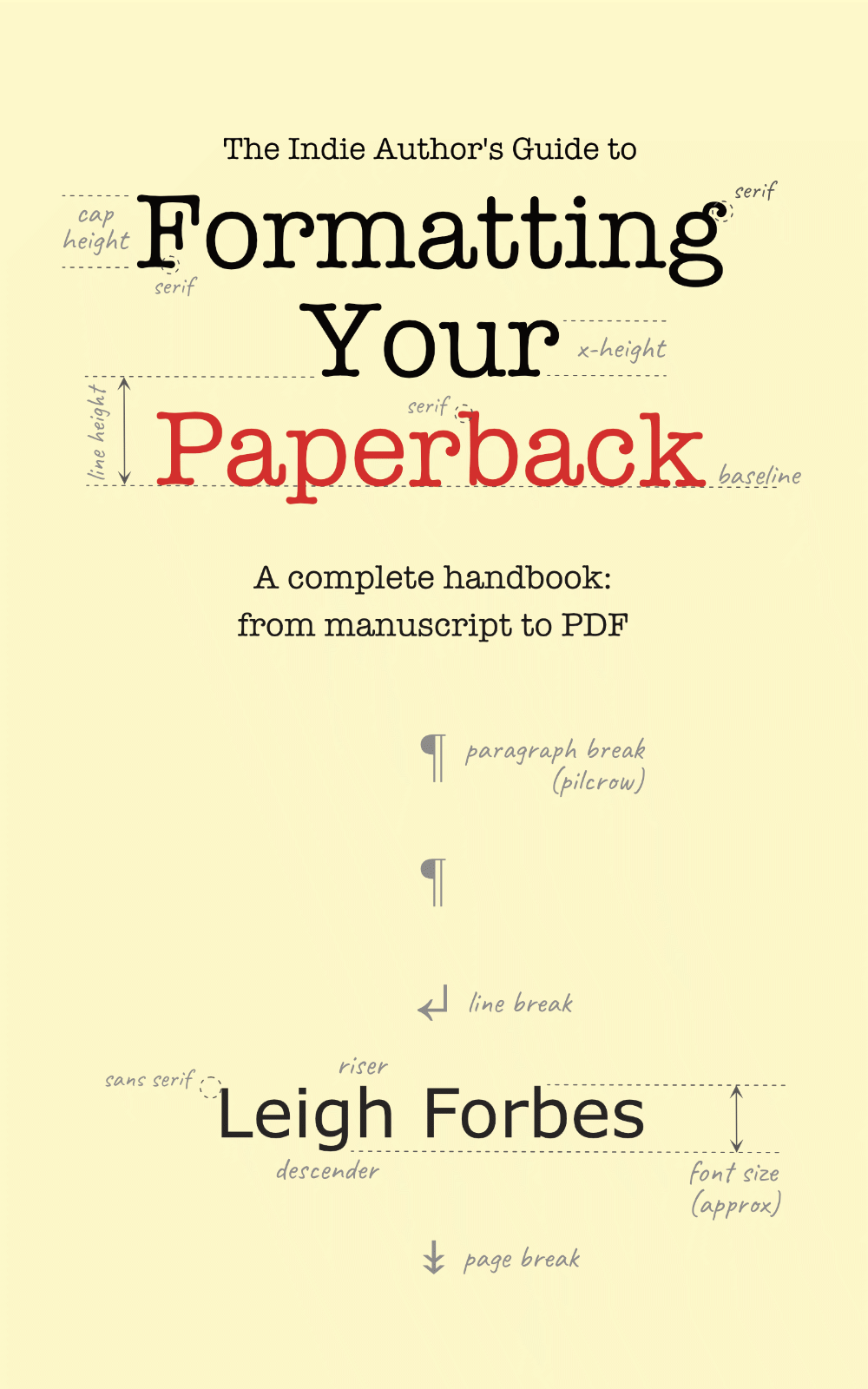
¹ Actually, it can be too late: I tell a story in The Indie Author’s Guide to Formatting Your Paperback of a author who approached me for advice about a complex 100k-word academic manuscript – twenty years of work – written in multiple Word documents, in multiple styles. Was there any way, he asked, of restyling all the files to match each other, without working through every paragraph one by one to save his formatting? … Sadly, no.
Related Posts
Hyphenation & JustificationChoosing a Font
Readability
Whitespace
Tracking
Kerning
Need more help?
If you need help with this topic, or any other formatting issue, come and find me on Bluesky @writeleighso or facebook @blotpublishing