100% written by a human mini picture of a robot face with a red cross over it

Leigh’s Typography Blog


The background is red at the top and white at the bottom, against which is set the thin-and-thick vertical black stripes of a barcode. At the top of the barcode (where the white background turns to red), though, many of its lines are extended to look like bare tree-trunks. A few trunks have branches on them, and even one or two leaves. Amongst the trees, apparently standing on the white base of the image, is a white stag, facing right, and lifting his head as though he's sniffing the air.

Barcodes

Graphic Design

A (very) brief history of barcodes, how to make your own barcode, and some wonderfully creative barcodes in use today. (Also a note on QR codes.)
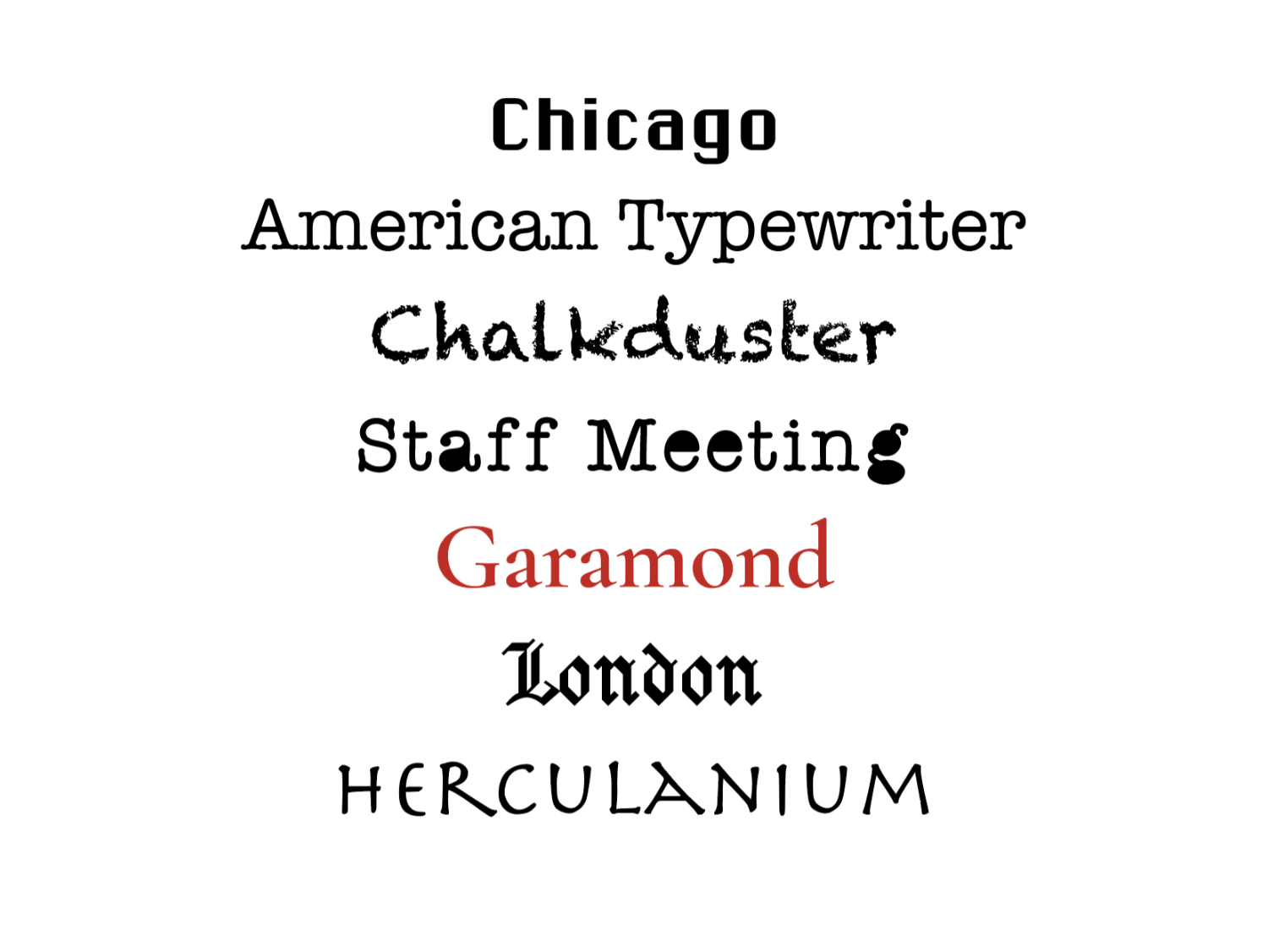
A list of words (almost all) in black on a white background, each set in the typeface named by that word - they are Chicago (a blocky sans-serif), American Typewriter (looks  typewritten), Chalkduster (looks like it was written in chalk), Staff Meeting (looks like a typewriter font, but has the enclosed parts of the a, e, and g coloured in black - like someone has doodled in a staff meeting!), Garamond (a beautiful serif typeface, here printed in dark red), London (in blackletter), HERCULANIUM (in a Roman-era style font).

The Naming of Type

Typography

The very earliest European typeface names were simple identifiers, named after their style (the Aldine italic), their language (grecs du roi ), the book in which…
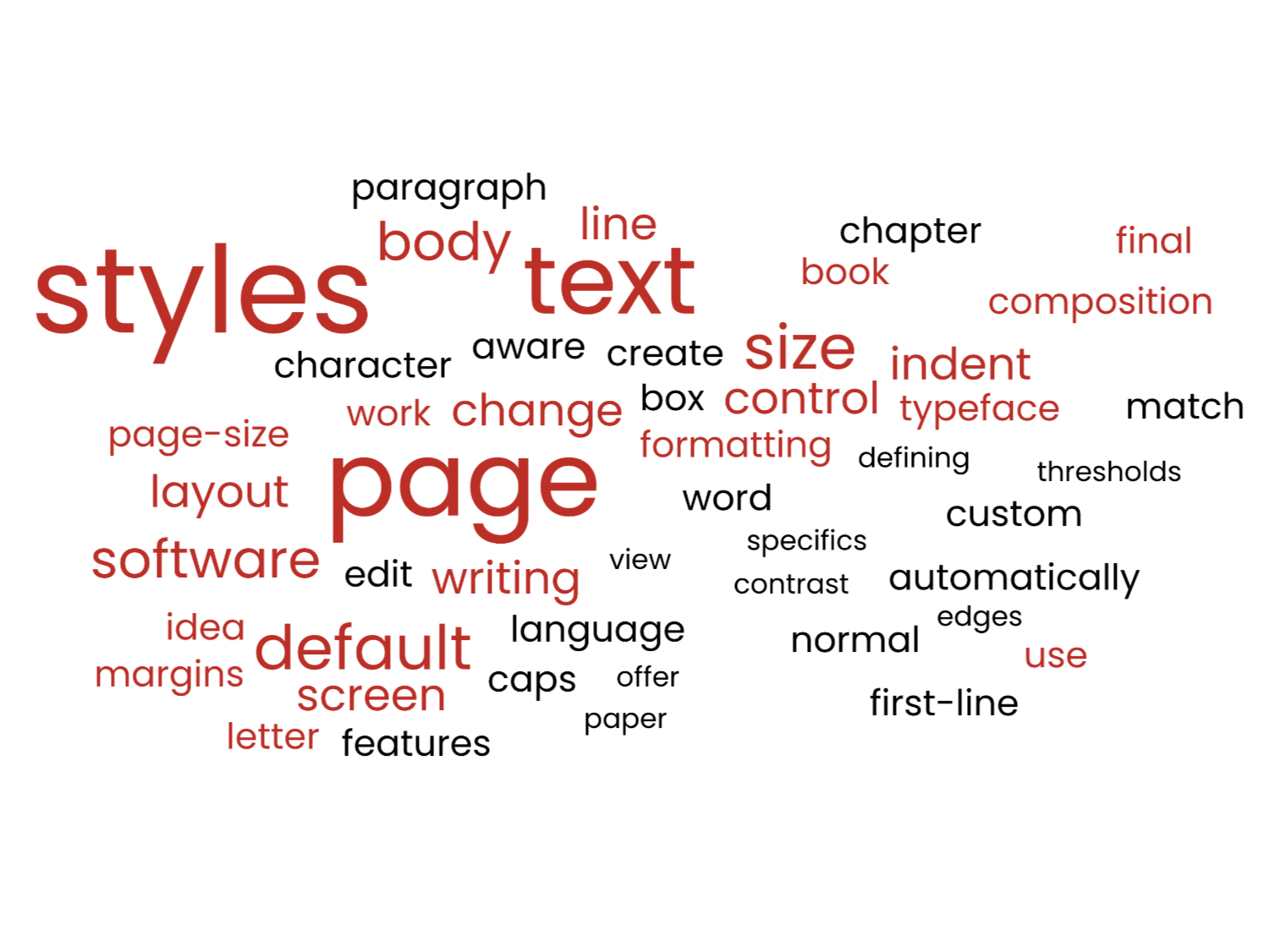
A word cloud with dark-red and black words. The three largest are 'styles', 'page', and 'text'. Other words are all related to stylesheets and text-design.

Stylesheets

Writing

The time to start using stylesheets is now; it’s never too late. Even if you haven’t yet made your final choices for typeface and font-size, and have…
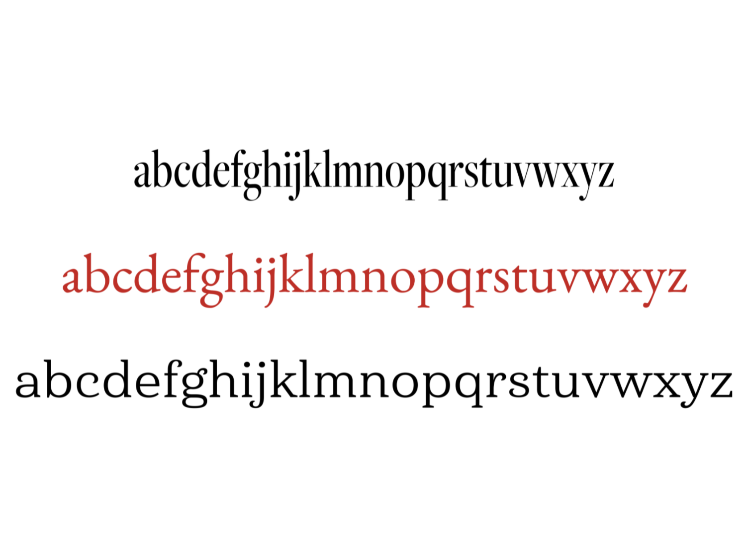
A white rectangle with the alphabet typed in three different fonts, showing the different lengths of the alphabet depending on the typeface used. The middle line is in red.

Readability

Layout

Readability, n., the ease with which a text may be scanned or read; the quality in a book, etc., of being easy to understand and enjoyable to read…
A white rectangle with the word &ndash Whitespace – typed in black in the middle.

Whitespace

Layout

One request I get a lot when designing print books for indie authors is, could I please fit everything into the smallest amount of space to keep the…
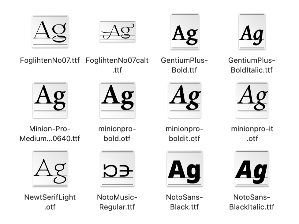
This shows the contents of a computer font folder, with the individual font-files displaying as little square icons with the letters A and g in the particular style of each font. Underneath the icons, the file names are shown (including which particular variant each belongs to).

Choosing Your Font

Typography

What font should I use? As a designer, I get asked this question a lot, but I never mind, because I love talking about typography – I also get to help folk avoid the risk of…
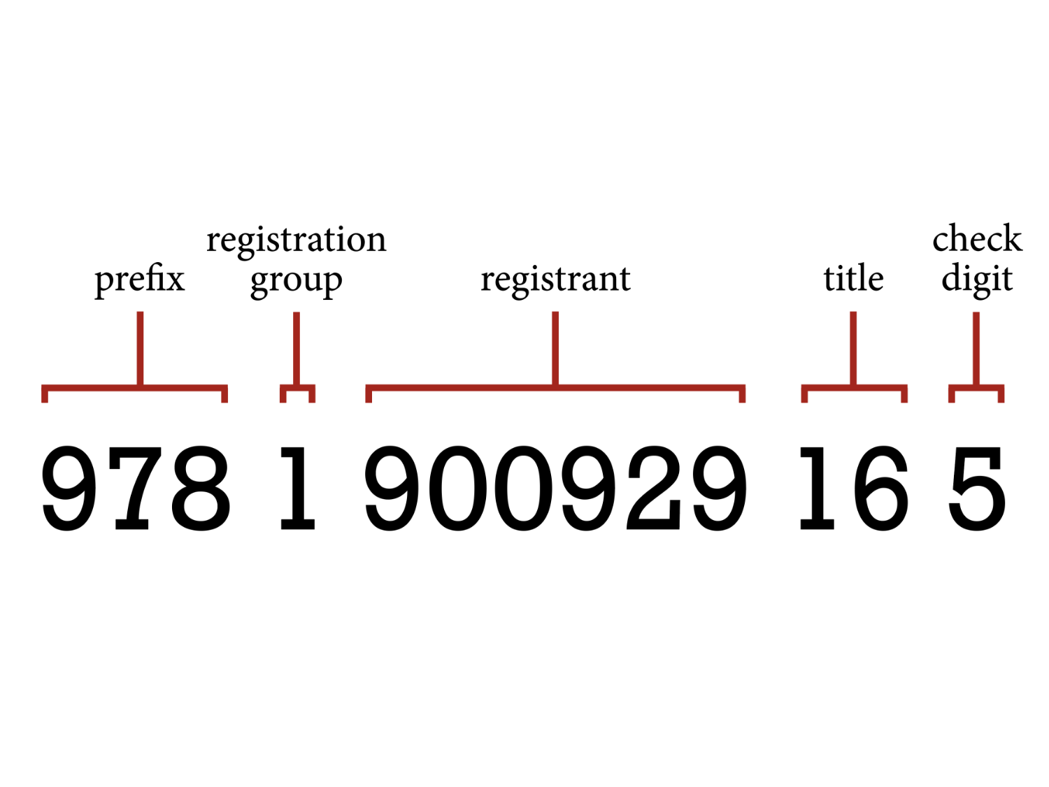
a breakdown of the numbers within an ISBN. The first three numbers, 978, are labelled as the Prefix. The next one, 1, is labelled as the Registration Group. The next group, 900929, are labelled as the Registrant. The next two, 16, are the Title. And the final one, 5, is a Check Digit.

ISBN Explainer

Publishing

A brief history: the ISBN was conceived in 1967, the brainchild of David Whitaker (a great-great-grandson of Joseph Whitaker, publisher of Whitaker’s Almanac and…
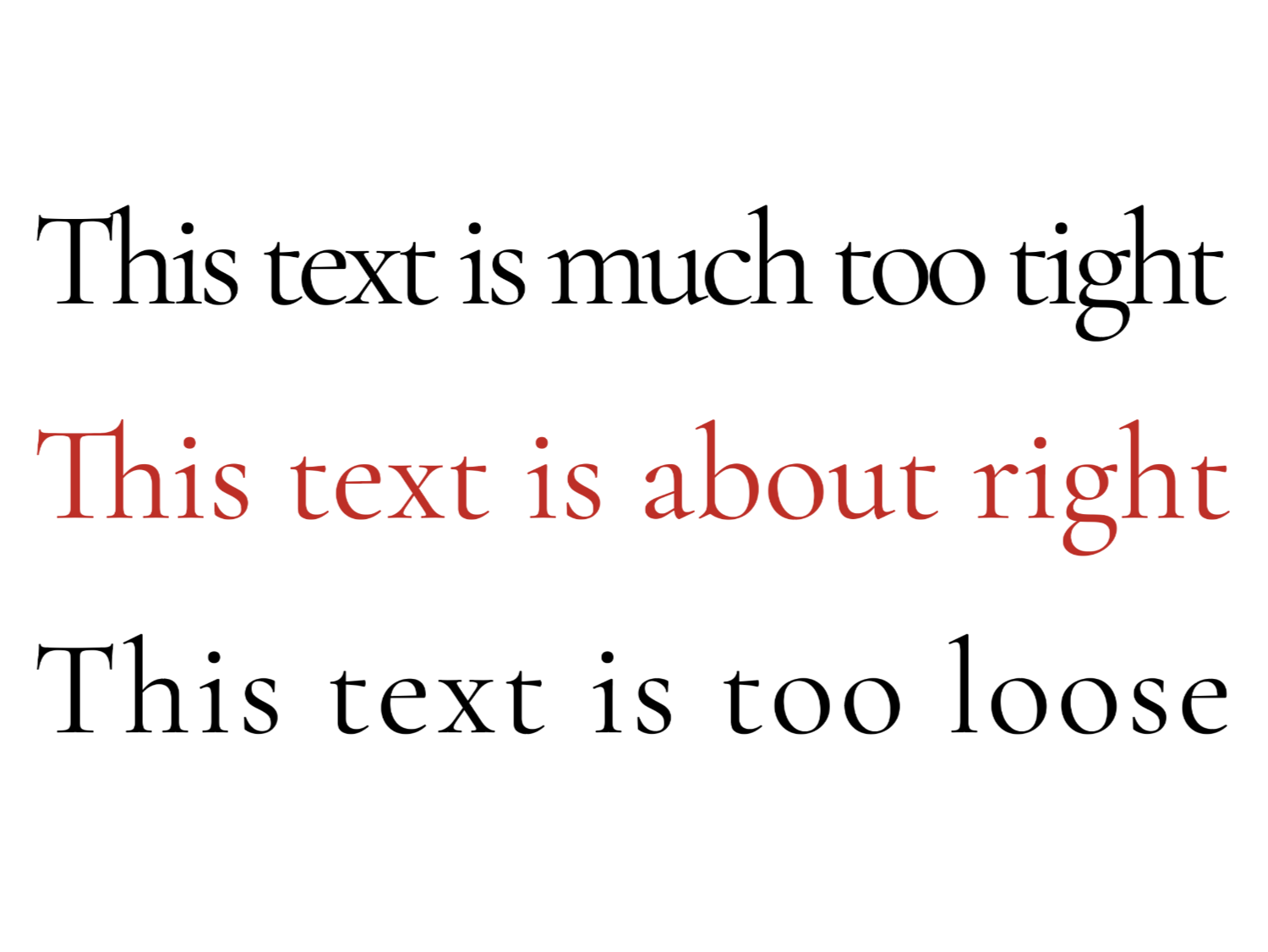
three lines of text – the first reads ‘this text is too tight’ (the words and letters are squashed up), the second reads ‘this text is about right’ (the words and letters are nicely spaced), and the first reads, ‘this text is much too loose’ (the letter spaces are almost as big as the word spaces).

Tracking

Layout

Tracking and kerning both allow you to change the horizontal space between your letters and words, but for different reasons: tracking alters…
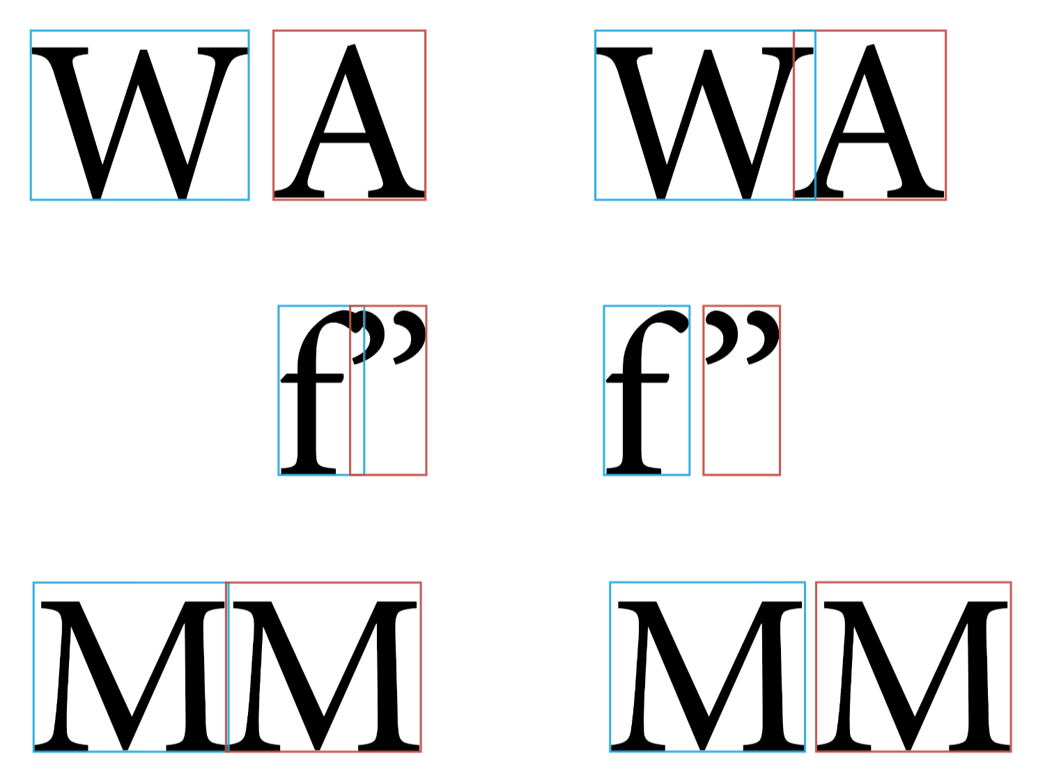
This graphic shows three pairs of glyphs before (left) and after (right) kerning. The first pair (W A) are initially too far apart, the second pair (f ”) are crashing into each other at the top, and the third pair (M M) are touching serifs at the bottom. On the right, the W and A have been brought closer together, while the f ” and the double-M have been separated. There is a zommable version in the article.

Kerning

Layout

Kerning is one of the two controls you have over the horizontal space in your text, allowing you to alters the space between a particular pair of glyphs.…
No image yet

Hyphenation & Justification

Layout

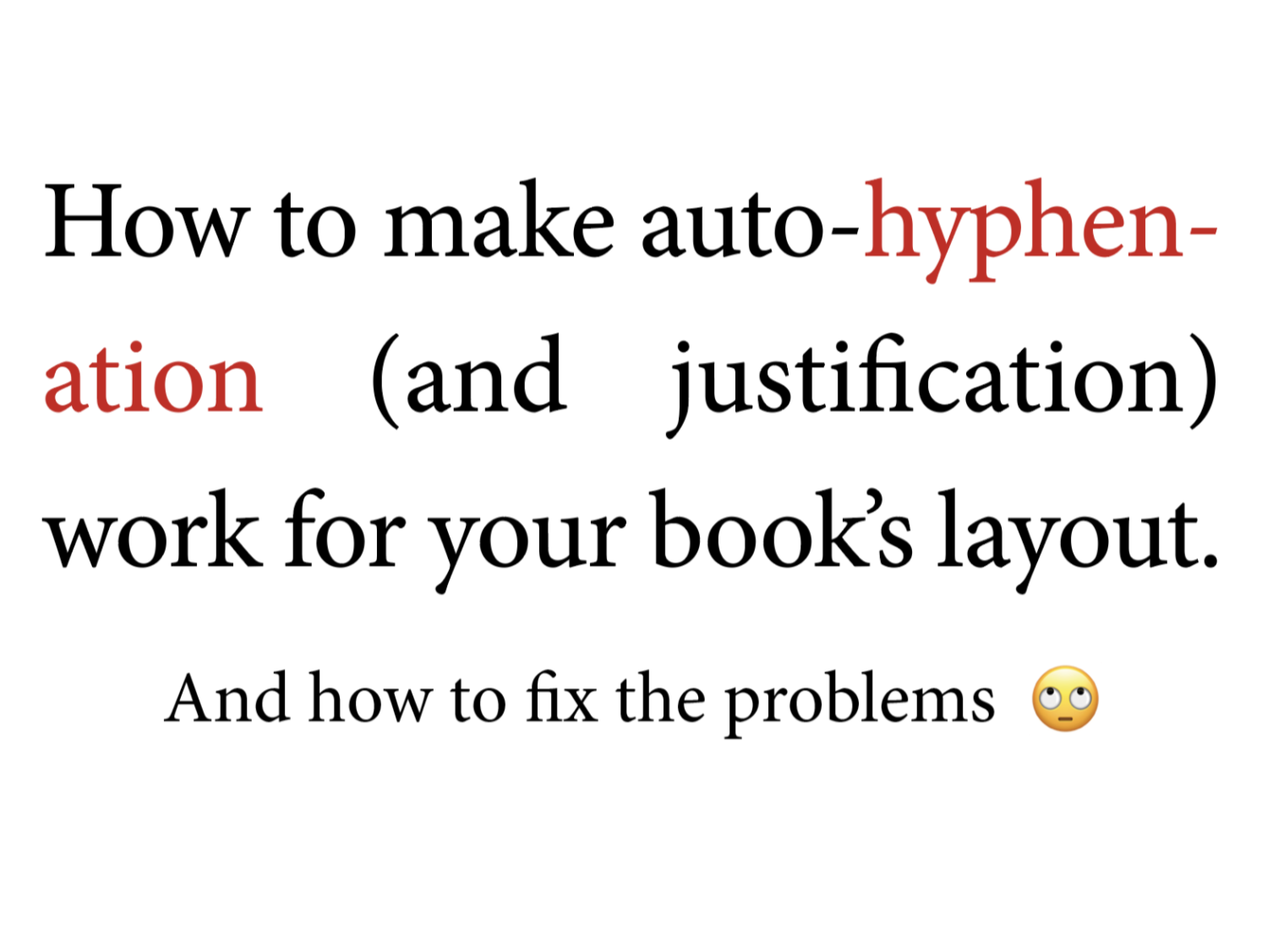
This post is about how to control your software’s use of hyphenation and justification to manage the spaces between words on a line, particularly when…
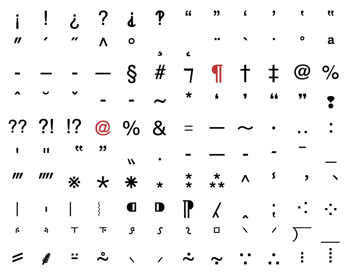
This is an except from the Apple Mac glyph palette, showing a block of 120 individual characters of various types, including the at-sign, the hashtag (octothorpe), the section sign, the percent sign, double and triple primes, and so on.

Punctuation & Other Squiggles

Punctuation

Punctuation is an art, for sure – conveying as it does such subtleties of meaning; helping you transmit what you’re thinking into someone else’s head, without…
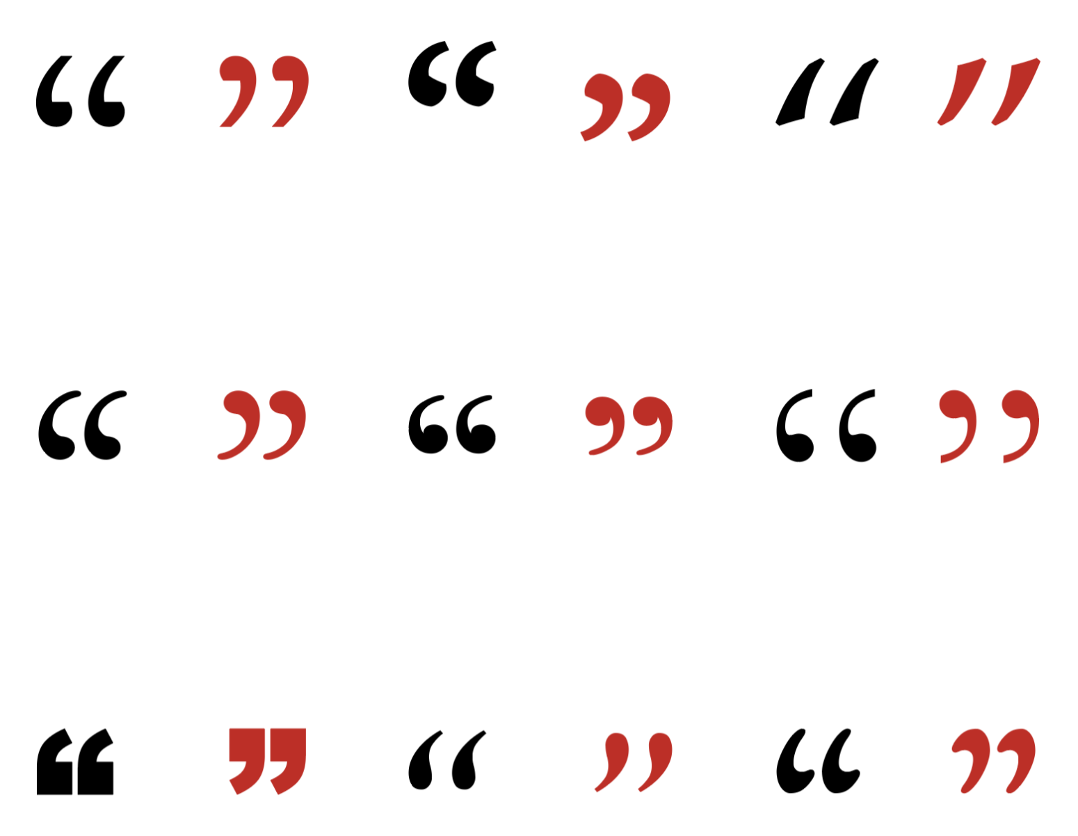
This shows nine pairs of double quotation marks in various typefaces, ranging from the classic 66 and 99 style, to more squared and blocky or looser styles. The opening quotes are all black. The closing quotes are all red.

All About Quotation Marks

Punctuation

Whether you’re publishing fiction or non-fiction, the chances are you’ll be using quotation marks at some point, and as different typefaces…
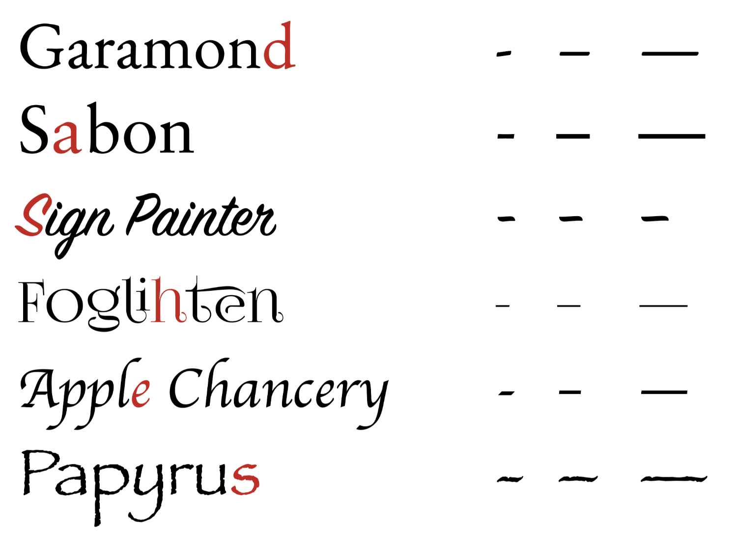
This shows seven sets of dashes (hyphen, en-dash, and em-dash) for each of the fonts: Garamond, Sabon, Cormorant, Lora, Minion, Baskerville, and Caslon. The differences between the dashes are quite subtle: some of them are slightly slanted, some are thicker than others, and some have fine details at their tips (such as rounded or gently splayed ends). The text is all in black, except the d of Garamond, the a of Sabon, the S of Sign Painter, the h of Foglihten, the first e in Apple Chancery, and the s of Papyrus. These are in red, and spell out the word, dashes.

All About Dashes

Punctuation

The three dashes you are most likely to encounter when formatting your book are: the hyphen (-), the en-dash (–), and the em-dash (—). The en-dash and em-dash are…
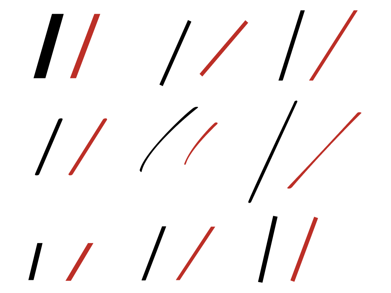
This shows nine pairs of dashes the virgule in black on the left of each pair, and the solidus on the right in red. The virgule generally stands at about 20-degrees right of the vertical, and the solidus more like 30-degrees. But this image also shows the variety between different fonts – some slashes are bold and blocky and others thin and whispy. One pair is curved.

All About Slashes

Punctuation

At first sight, there might not seem much between the virgule ( / ) and the solidus ( ⁄ ), but it’s worth knowing what each was designed for, because…