Blog > The Naming of Type
The Naming of Type

Leigh Forbes
The Naming of Type is a difficult matter,
It isn’t just one of your holiday games;
You may think at first I’m as mad as a hatter
When I tell you, a font must have THREE DIFFERENT NAMES
(With apologies to T. S. Eliot)
Early Typefaces
The very earliest European typeface names were simple identifiers, named after their style (the Aldine italic), their language (grecs du roi ), the book in which they first appeared (Gutenberg’s 42-line Bible), or the author of the book in which they first appeared (Donatus).
Once different sizes became commonplace, the point-size or name was also included, giving each font a three-part identifier, e.g. Fournier’s 20pt roman or Fell’s Double Pica Roman, or, confusingly, Caslon’s English Arabic (‘English’ being the name of a font-size, now equivalent to 14pt; double pica is 24pt). And fonts still have these three-part identifiers today, defining their typeface, style, and size – “Times / (New) Roman / 12pt” being one world-weary example. (See also Choosing Your Font for more about Times New Roman.)
Digital Typefaces
Once the computing age arrived, printing types went out of the window (rather than into the River Thames*), having given way to digital typefaces. The first digital typeface is considered to be Digi Grotesk, designed in 1968 for use in a digital typesetting machine. Each of its ninety-five glyphs was programmed in binary with the coordinates of all the ‘bits’ needed to display the whole ‘map’ for that glyph. Hence ‘bitmap’. Ilene Strizver of The Type Studio, perfectly describes the process of bitmap-design as, “comparable to superimposing a sheet of graph paper over a drawn letter and colouring in the boxes (pixels) that fell within the outline of that letter”.
*Over the course of six months in the mid-1910s – in revenge against his business partner at Doves Press in London – Thomas Cobden-Sanderson tipped the entirety of their beautiful serif type – maybe as many as 200,000 individual pieces – plus the punches and matrices (from which new type is made) over the edge of Hammersmith Bridge, and into the river. For more on this story, check out Lara Maiklem’s book, Mudlarking: lost and found on the River Thames.
New Fonts? Yay!
When I first discovered Apple Macs, I was delighted by the existence of fonts (you didn’t get such refinements on an Olivetti Lettera 22 or an Acorn BBC Micro). The earliest Mac fonts were Geneva, Chicago, New York, Monaco, San Francisco, Los Angeles, Athens, Toronto, Cairo (dingbats), London, and Venice, and most of these (or all of them – it was a while ago) were still in residence when I moved to Mac in the early 1990s.
The first of these typefaces had been named originally after stops on the Paoli–Thorndale line in Philadelphia (where designers Susan Kare and Bill Atkinson had met at school), but Steve Jobs wanted names of “world-class cities”, not “little cities, that nobody’s ever heard of”. And so the World-Class Cities series was born.
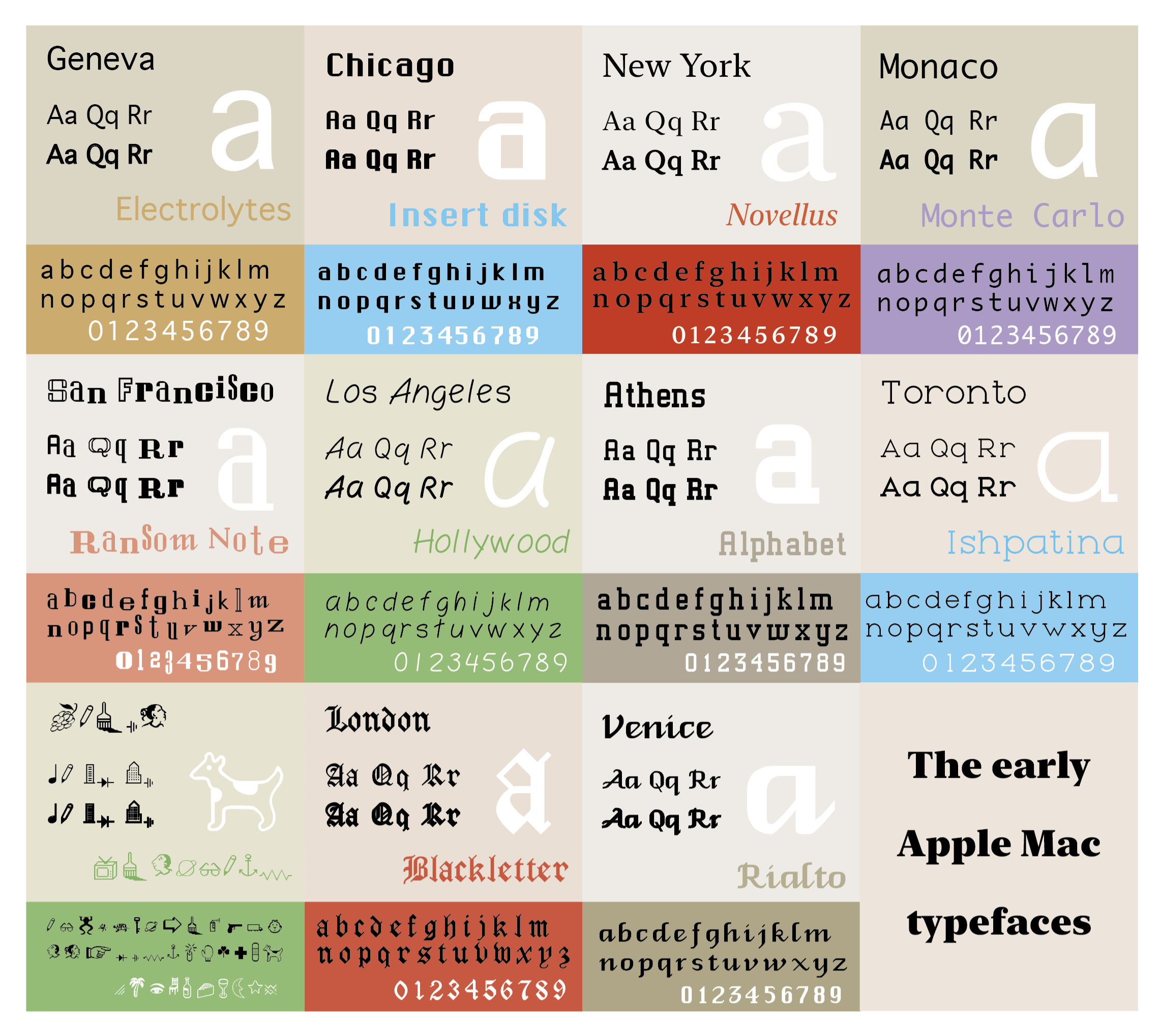
The typefaces (originally bitmapped) available on the first Apple Macs in 1984. All but one was designed by Susan Kare; the other (Venice) was designed by Bill Atkinson. The dingbats typeface, bottom left, is Cairo. Hover-over to enlarge.
Over the decades, myriad new fonts appeared with each system update, some still bearing city names – Baghdad (Arabic), Beijing (Chinese), Seoul (Korean), Hiragino (Japanese) – others bearing names that made their appearance obvious without looking – e.g. Chalkboard, Papyrus, American Typewriter – and others with apparently random names – Baskerville, Old Goudy, Garamond, Bodoni, Zapfino… but many of these latter fonts weren’t new at all; they were new to computers for sure, and to folk who had never encountered typography before, but they weren’t new typefaces†. And their names weren’t new either.
†Although many people use the words ‘typeface’ and ‘font’ ‡ interchangeably, they actually have subtly different meanings. See the Nerd Box for more info).
‡ According to the Oxford English Dictionary, the word font (also fount) comes from the Middle French fonte, meaning: “cast iron (1477…), action or process of melting or founding (1488), action of producing objects from molten metal (1551), set of type (1567)”.
NERD BOX: the difference between a typeface and a font
A printing ‘type’ is a block of wood or metal that can be laid in a press, inked, and applied to paper to make its mark. The top face of the type – the typeface – is the business end; the part that’s been cut to form the design-to-be-inked/printed (a letter, number, punctuation mark, ornament, or other glyph); though the word typeface came to mean the design of the glyph-set as a whole. (And so a typewriter is a machine that lets you ‘write’ by stamping ‘type’ onto a sheet of paper through a pre-inked ribbon, rather than enduring the laborious – and incredibly messy – process of traditional printing. But I digress. [See Punctuation & Other Squiggles for a little more about typewriters.])
A font, is a specific variant of a typeface, such as Georgia 14pt bold, or Avenir 10pt italic – this is because in days of moveable type, a printer would have many many different versions of a particular typeface, allowing for its printing in any given size or weight (or combination thereof). Nowadays, fonts no longer appear as separate styles in your computer’s font-menu (so it should be a typeface menu really!) – meaning we now tend to think of them as simply the digital version of their respective typefaces, which is fine. I like to keep the history alive, but language evolves, and that’s fine too. (See also the section on ‘Faux Styling’ in our How to Choose Your Font post, for how to avoid PDF and printing errors caused by missing font files within a typeface.)
Going back to those randomly named fonts – many of them are actually based on the some of the earliest typefaces in Europe, and are much, much older than our modern digitised (and often heavily tweaked or completely redesigned) versions. These are fonts we use every day without knowing the pedigree they carry, or the history behind them, not to mention the sometimes-years of work that went into designing and cutting them in the first place.
Below are some of my favourite examples (plus a few newer ones), followed by details of the designers/printers/punch cutters for-or-after whom they are named. (For those who are interested in exploring more, a list of sources can be found at the bottom of this post.)
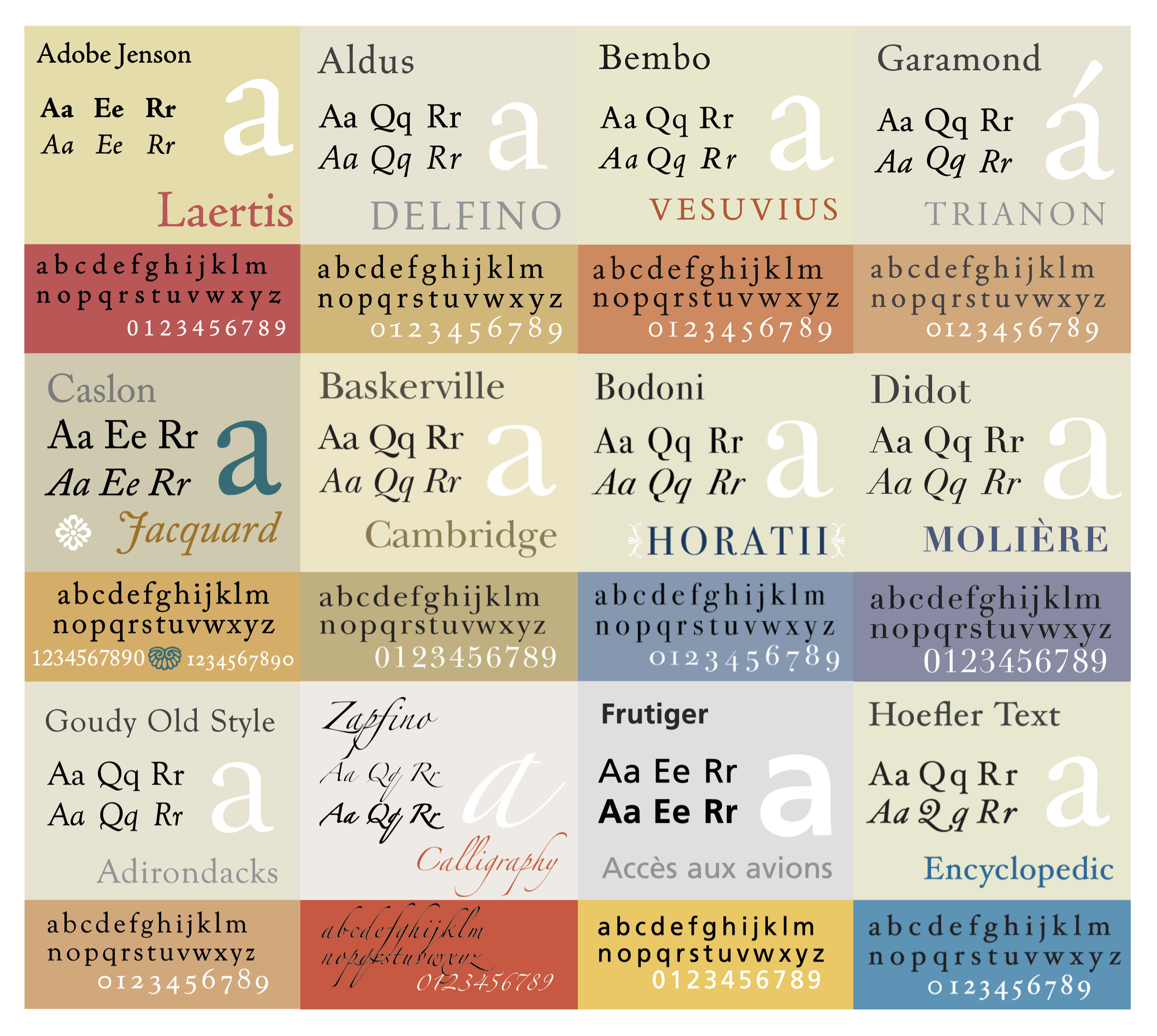
Samples of typefaces based on designs by some of the old (and new) masters of type design – see list below. Hover-over to enlarge. Original samples (except Zapfino): Wikipedia Commons.
| Designer | Location | Dates | Trivia |
|---|---|---|---|
| JENSON, Nicolas |
Venice | c.1420–1480 | Jenson’s roman was the inspiration for William Morris’s Golden Type typeface (1890). |
| MANUTIUS, Aldus |
Venice | c.1450–1515 | Aldine Italic (1500) was the first italic/cursive typeface. The typeface ‘Aldus’ was not designed by him, but named for him, by Hermann Zapf (see below), in the 1950s. |
| BEMBO, Pietro |
Venice | 1470–1547 | Bembo was the author of an early publication by Aldus, in 1495; the typeface used (cut by Francesco Griffo) was named after him. |
| GARAMOND, Claude |
Paris | c.1510–1561 | From 1988–2005, the word “The” on The Guardian newspaper’s masthead, was printed in Garamond italic (the rest of the title was Helvetica bold). |
| CASLON, William (the elder) |
London | c.1692–1766 | One of Caslon’s typefaces was used to print the US Declaration of Independence. |
| BASKERVILLE, John |
Birmingham, England | 1707–1775 | Baskerville was (probably) the first printer in Europe to use ‘wove paper’ – now the standard – using a woven wire base on which to lay the pulp. |
| FOURNIER le Jeune, Pierre Simon |
Paris | 1712–1768 | As well as many text typefaces, Fournier was the first to print ‘round’ musical notes (1756) – printed scores before that had mostly square or diamond-shaped notes. Fournier also developed a point-size system (1737) that was used in Belgium until the 1970s. |
| BODONI, Giambattista |
Parma, Italy | 1740–1813 | Nirvana used Bodoni on their album covers. |
| DIDOT, Farmin |
Essonnes (near Paris) |
1764–1836 | Didot was the first to coin the word “stereotype” (1800), describing printing using a mould, which revolutionised the book trade. Didot’s father, François-Ambroise Didot, developed an alternative point-size system, which (with some adjusting to metric) is still used in Europe. |
| GOUDY, Frederick William |
New York | 1865–1947 | Goudy Old Style (1915) is used in headings for The Spectator, and also as body text in Harper’s Magazine. Goudy also designed Copperplate Gothic (1905). |
| ZAPF, Hermann |
Frankfurt | 1918–2015 | Zapf designed a huge number of fonts, most notably: Palatino (1949), Aldus (1954), Optima (1958), Zapf Dingbats (1978), Zapf Chancery (1979), Zapfino (1998). The Lucida family of fonts was designed by two of his students, Kris Holmes and Charles Bigelow. |
| FRUTIGER, Adrian |
Bremgarten bei Bern, Switzerland | 1928–2015 | Frutiger’s notable fonts included Univers (1957), Frutiger (1976), Avenir (1988), and Herculanum (1990). Many footballers wear Frutiger on the back of their strips. The UK’s National Health Service (NHS) also uses Frutiger as it’s main typeface (its secondary typeface is Arial). |
| HOEFLER, Jonathan |
New York | 1970–living | Amongst other fonts, Hoelfer has designed Hoefler Text (1991), Troubadour (1994), and Hoefler Titling (1996). Hoefler Text has been included in every MacOS since 1991. |
Sources
Baskerville, The Biography of a Typeface. Garfield, Simon. Weidenfield & Nicolson (London). 2023.
Elements of Typographic Style, The, 4th edition. Bringhurst, Robert. Hartley & Marks (Seattle). 2019.
Five Hundred Years of Printing, 3rd edition. Steinberg, S. H. Penguin (Harmondsworth UK). 1974.
Gutenberg Revolution, The. Man, John. Headline Book Publishing (London). 2002.
Introduction to Paper, An: its manufacture and use. Day, Frederick, T. Newnes Educational Publishing (London). 1962.
Introduction to the History of Printing Types, The, 2nd edition. Dowding, Geoffrey. British Library (London) and Old Knoll Press (New Castle, DE). 1998.
Just My Type. Garfield, Simon. Profile Books (London). 2011.
Oxford English Dictionary, s.v. “font (n.2), Etymology,” July 2023, https://doi.org/10.1093/OED/8509752908. Accessed 17th October 2024.
Printing Types, Vols I & II, 4th edition. Updike, Daniel Berkeley. Old Knoll Press (New Castle, DE) and British Library (London). 2001.
“World Class Cities”. Kare, Susan. Folklore (online). 1983. https://www.folklore.org/World_Class_Cities.html. Accessed 19th October 2024.
And also, for geeks everywhere, I heartily recommend this novel:
Mr Penumbra’s 24-Hour Bookstore. Sloan, Robin. Farrar, Straus and Giroux (New York) 2012, or Atlantic Books (London), 2013.
Related Posts
Choosing Your Font
Readability
Stylesheets
Blog Index
Need more help?
If you need help with this topic, or any other formatting issue, come and find me on Bluesky @writeleighso or facebook @blotpublishing